Sneak Peek into a Re-Brand
North Country Health Consortium (NCHC) is a NH nonprofit that has been steadily growing to a current staff of over 25. They were now at the point that their communications needed a complete overhaul, but they didn’t know where to start.

This is a yearlong process for them, and I‘ve just recently gotten over the hump of getting solid about who they are and what their new look should be. Now I’m ready to show off some design collateral. This stuff is just barely getting rolled out in NH, so none of it is reflected yet publicly.
In their growth, NCHC has developed several programs that were led internally by different directors and, due to the nature of this nonprofit’s focus on mission, came together visually haphazardly. My plan was to create a simple branding system that would allow new sub-brands to be developed quickly and easily from here on out. (Versus constantly rethinking fonts and colors, look and feel for every piece of collateral–to say nothing of missed opportunities to support the overall brand.)
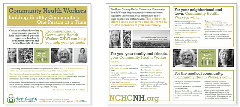
This simple system includes a palette of eight complementary colors with each program area (sub-brand) assigned to use only three.

So three colors plus two fonts and some simple graphics to fit into a small square. That is the system.

The fonts were updated on the parent (NCHC) logo to activate the visual association.
Then the minute the branding system was approved, NCHC had an urgent need in one of the program areas to develop materials... I accelerated my design-development process but still presented four options with time for revisions and refinement.
The final brand design includes an additional font that complements the logo system incorporated into a clean graphic structure featuring black and white photos for a more unified effect. The collateral for this program uses just the colors designated to this particular sub-brand. Other programs will have the same graphic look and feel but will feature that program’s color palette instead.
Because of my diverse skill set and the many creative services this client needed, the relationship was a match made in heaven. If your organization is in need of all the hats I wear (aka you don’t know where to start), let’s chat!
And if you’d like to see the before pix, CLICK HERE and I’ll send you before and afters.